Case Study: Echo
Brief · idea · process.
01 · The brief
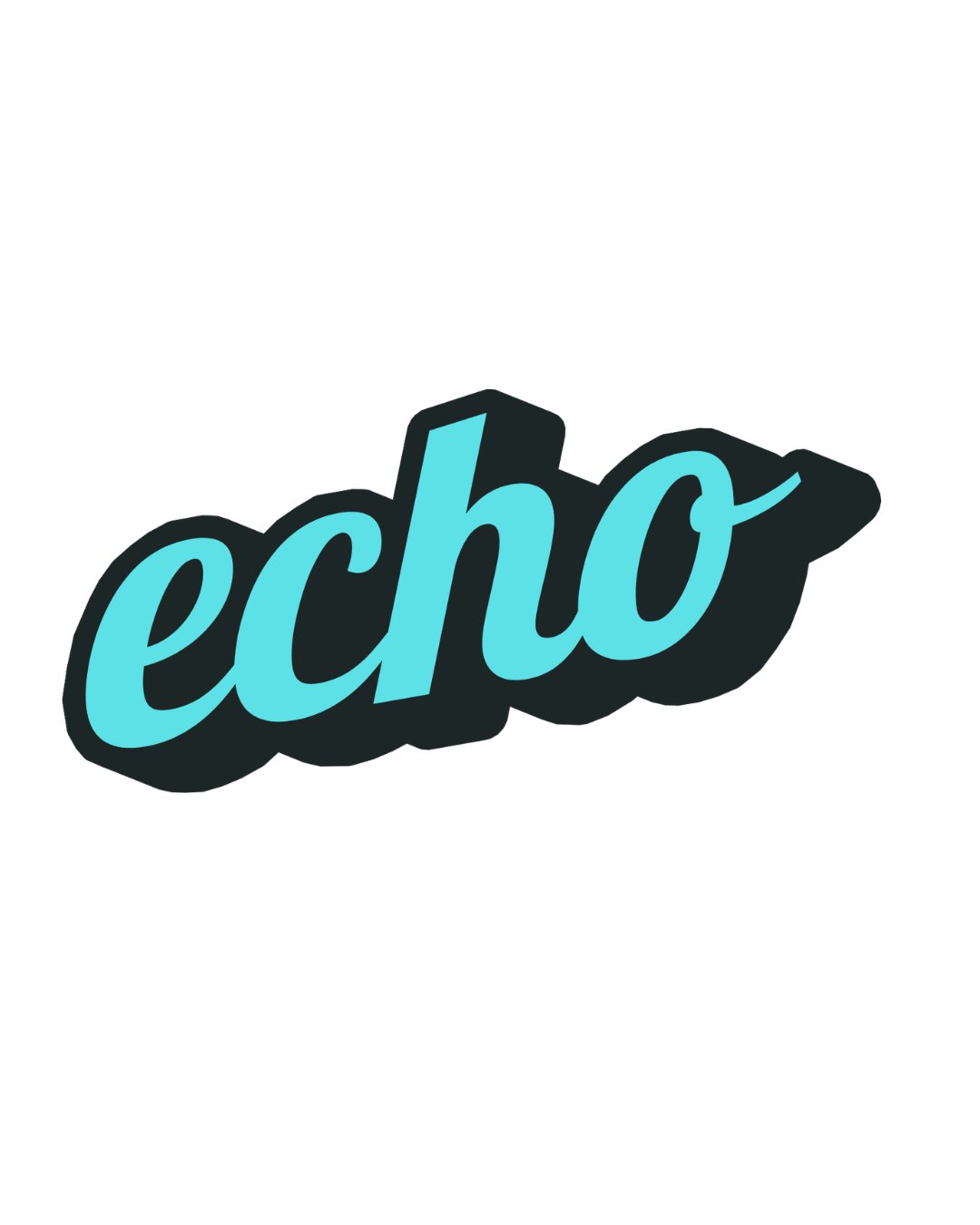
Create a logotype for Echo — a brand that needed to feel loud, friendly, and instantly repeatable. The mark had to work as an app icon, a sticker, and a storefront sign without losing its personality.
02 · The idea
The name is the concept. A bouncy retro script gives the word a spoken, sung-out-loud energy, while the heavy offset shadow behind it acts as the literal echo — the word repeated once, a beat behind itself. Lowercase letters keep it approachable; the exaggerated entry stroke on the “e” and the flicked-out “o” give it a start and an end, like a sound wave.
03 · Process & outcome
The word was hand-lettered first, then rebuilt in vectors and optically corrected so the bowls of the “e,” “c,” and “o” feel like one family. Color was kept to a single aqua on near-black so the mark survives one-color printing. The final logotype ships in stacked, horizontal, and icon-only (the “e”) lockups.