Case Study: Lamegames Studio
Brief · idea · process.
01 · The brief
Design a wordmark for Lamegames Studio, an indie game studio whose name is a self-deprecating joke. The challenge: honor the humor without making the studio itself look amateur.
02 · The idea
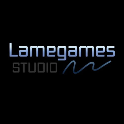
Play the joke completely straight. “Lamegames” is set in a sleek, rounded techno face with a cool blue gradient — the visual language of a AAA studio — so the irony lands harder. “STUDIO” steps back in a quiet gray, and a hand-drawn scribble flicks off the end like a signature: the human, imperfect touch that says the games are handmade.
03 · Process & outcome
Type tests ranged from pixel fonts (too obvious) to grunge faces (too edgy). The polished-corporate direction won because it makes the name funnier, not sadder. The gradient was tuned to stay legible on pure black, where game splash screens live, and the scribble was kept as a separate element so it can animate in motion graphics.