Case Study: The Caged Sanctuary
How one blue rectangle and three claw marks became a book cover.
01 · The brief
Design a cover for The Caged Sanctuary, a novel about a place that is supposed to be safe — and isn’t. The cover needed to read clearly as a thumbnail on online stores, feel literary rather than pulpy, and print cleanly in one accent color plus black and white.
02 · The idea
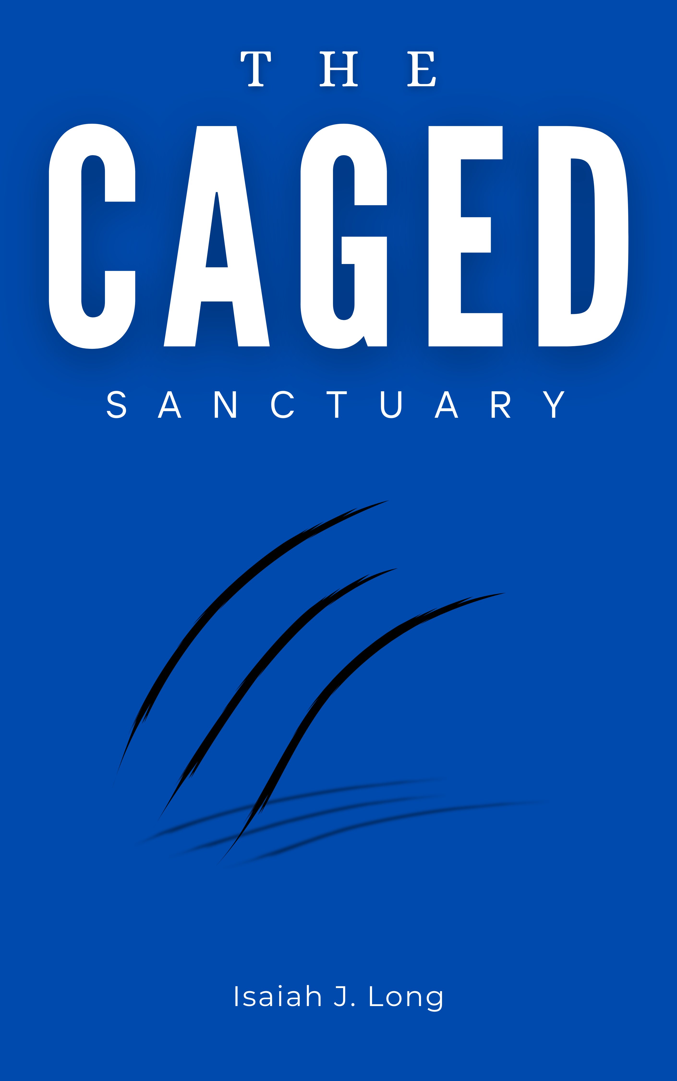
The title carries a built-in contradiction — caged versus sanctuary — so the design leans into it instead of illustrating a scene:
Calm surface. A flat, royal-blue field and quiet letterspaced type stand in for the “sanctuary.” No texture, no gradient, nothing to hide behind.
One violent gesture. Three claw marks rake across the open space below the title — the only organic shapes on the cover. Their soft drop shadow lifts them off the surface, as if something scratched the book itself.
Loud where it counts. “CAGED” is set in a heavy condensed sans at maximum width, while “THE” and “SANCTUARY” whisper around it in thin serif and tracked-out caps. At thumbnail size, the hierarchy survives.
03 · Process notes
Type exploration
Tested serif-only and sans-only stacks before landing on the high-contrast pairing. The mixed stack let “CAGED” dominate without shouting in every line.
Color decision
Royal blue tested better than red or black: it reads as “safe” institutional calm, which makes the claw marks feel like a violation rather than decoration.
Print specs
Delivered at 2820×4500 px (300 DPI for 6×9″ trim plus bleed), with the claw vector kept editable for the spine and back cover.
04 · Outcome
The final cover shipped with the published novel by Isaiah J. Long. One idea, executed with restraint — and it still reads from across the room.